Discipline / Brand identity and brochure design
Client / Pacific (Lifestyle) Limited
Project / Pacific Lifestyle brand identity and corporate brochure design
設計類別 / 品牌視覺系統及企業畫冊
客戶 / 港基時尚集團
項目 / 港基時尚集團品牌商標視覺系統及企業畫冊
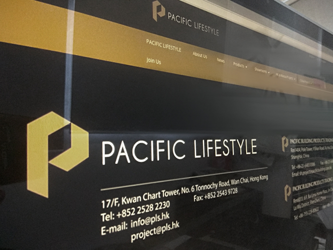
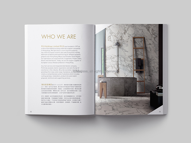
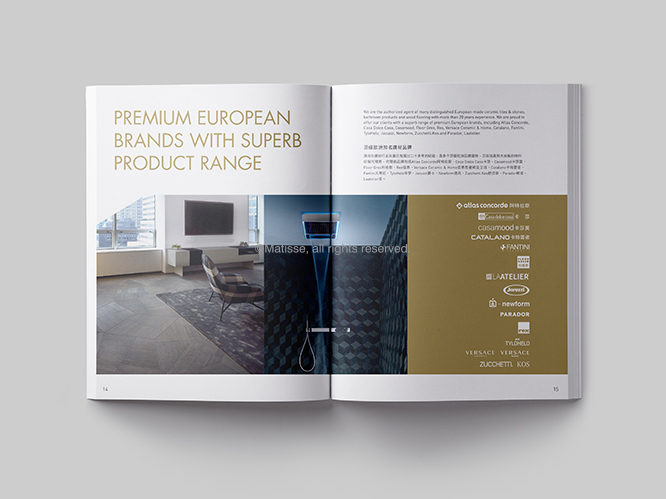
In 2018, Matisse was appointed for the rebrand exercise of the Pacific Lifestyle Group in order to present themselves better image and cater their expansion in times to come. Pacific Lifestyle Group is one of the leading distributors of building materials in Hong Kong with running numerous retail stores in Hong Kong, flagship stores in Shanghai and Shenzhen and sales outlets in more than 20 cities in China. Pacific Lifestyle specialized in supplying well-known European branded high-end ceramic tiles, bath & spa products and wood flooring to the famous property developers in Hong Kong, Macau and Greater China for their development projects including deluxe residential buildings, hotels, shopping malls and also commercial buildings. We had designed for them a new logo, corporate slogan, name card, letterhead and envelope and corporate brochure.
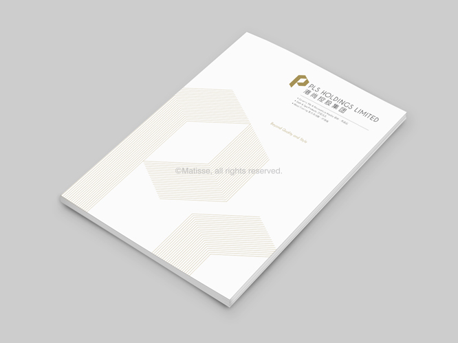
Logo concept
The golden "P", a new signification of Pacific Lifestyle Group, carries a modern and pioneering face to the brand. The simplified and structural form of the letter reflects the simple, sleek and luxurious aesthetic of its European brands that delivered in the interior decoration aspect. The embedded arrow in the "P" also suggests the forward-looking vision of the company. Changing from the original red to the new gold color is to solidify the company's establishment and projects its prosperity in future. It also symbolizes nobleness, glory, luxury and brilliance. It adorns the ordinary space and is in line with the image of “Pacific Lifestyle”. The minimal yet elegant font just adds the tasty touch to the brand.
在2018, Matisse被委託為港基時尚集團設計其全新的企業視覺形象系統,包括商標、標語、名片信封信紙及企業畫冊,為配合集團的品牌及業務發展。港基時尚集團在香港及國內營運多間門市,在上海及深圳設有旗艦店,並成功在國內超過20多個城市設立銷售門店,是為香港其中一間最大的建材供應商,專門為中國、香港及澳門等地的大型發展商所屬的豪華住宅、酒店、商場及大型商業大廈等發展項目中,提供歐洲各國的知名高級瓷磚、衛浴潔具及木地板。
商標概念
金色的“P”是港基時尚Pacific Lifestyle的新標誌,為品牌帶來了現代和開拓性的面貌。簡約的結構透徹地反映了Pacific Lifestyle所代理的歐洲品牌在室內裝飾方面的簡潔、時尚和奢華美感。在設計上, 以雙向箭頭嵌入金色的”P”字之內, 表明了企業的前瞻性願景, 並以黃金色表達鞏固公司的基礎並預瞻未來的發展與繁榮。與此同時,金色更象徵著高貴、光榮和輝煌, 為平凡的空間作點綴,正正切合了Pacific Lifestyle品牌及產品形象。簡約的字體也為品牌增添了時尚格調。